
Every project builds the brand.
These pieces show how thoughtful design and strong ideas can show up at any scale. These projects may be smaller in scope, but this is the work that carries the brand forward in the everyday: shaping perception, driving engagement, and making sure the small stuff still makes a big impact.

Ball 140th Anniversary Jars Landing Page
To celebrate Ball’s 140th anniversary, the brand released a limited-edition series of pint-sized mason jars inspired by their ornate 1880s designs. These collector’s jars feature an embossed vintage-style pattern and are part of Ball’s Keepsake Collection. When designing the landing page, I leaned into the vintage pattern and styling, utilizing decorative borders and layered graphics. The result is a cohesive experience that connects the product’s physical packaging with the digital experience, serving as a nod to Ball’s rich history in home canning while connecting with a new generation of makers, crafters, and collectors.


Crock-Pot Feed It Forward Social Graphics
As part of Crock‑Pot’s Feed It Forward campaign for Hunger Action Month, I designed a series of animated GIFs for social media. The animations were crafted to feel inviting and shareable, aligning with Crock‑Pot’s approachable tone, while standing out in busy social feeds. Engagement was strong, with over 22K likes before breakfast! The campaign supported Feeding America by donating up to 250,000 meals. These pieces played a key role in extending the reach of this effort across digital platforms.
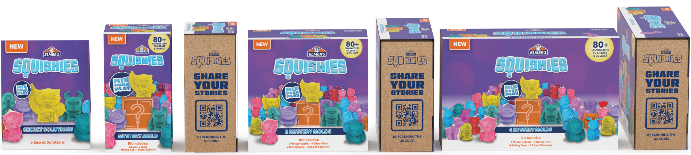
Elmer’s Squishies Concepting
During a rapid design session, I developed a key visual and initial concepts that became the foundation for Elmer’s Squishies packaging design. The concept needed to capture the playful, sensory nature of the product while standing out on shelves and appealing to both kids and parents. This initial creative direction helped set the tone for the final pack, and ultimately shaped how the product was introduced to market. The product was a hit, earning a Good Housekeeping Best Toy award in 2024 and driving strong sales as a top-performing sku for the company that year.
Initial packaging concepts

Initial key visual design

Final packaging design


Crock-Pot Go Concepting
When a colleague was stuck on initial concepts for Crock-Pot Go—an electric, portable lunchbox—I jumped in to help push things forward. The brand team wanted something more disruptive than their current packaging, so I explored three directions. They ultimately chose my “Racing Stripes” concept, which used a bold color palette and angled checkered pattern to emphasize movement and portability. That initial design stayed largely intact through production and sparked a series of bright, energetic social images that brought fresh momentum to the brand.


Final Packaging

Digital asset example