
Crock-Pot Color Refresh
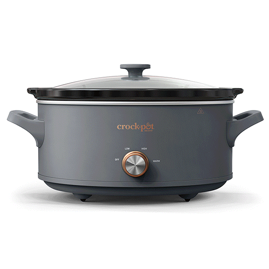
To support Crock‑Pot’s evolution from a traditional value slow cooker to a premium one‑pot solution, we led a strategic color refresh across 12 core SKUs. The goal was to modernize the product line with a curated, elevated palette that complements today’s design-forward kitchens.
Process & Solutions
Partnering with brand strategists, product designers, photographers, and videographers, we defined a cohesive palette that felt fresh yet timeless. I helped develop new photo and video content to support updated packaging and digital assets, with a core objective to create a more cohesive visual identity across the line. All touchpoints—from ecommerce to in-store—reflect Crock‑Pot’s shift toward a more modern and premium brand expression.

Results
The updated color assortment delivered strong alignment with both brand and consumer expectations. Retail partners responded positively to the streamlined offering, and the cohesive design system allowed for greater flexibility in merchandising and storytelling. The visual refresh not only elevated Crock-Pot’s shelf presence and digital footprint but also supported the brand’s long-term strategy of premiumization—positioning it to compete in the higher-end one-pot category while remaining approachable for families seeking both function and style.


Kudos to the team!
My roles: Lead Design, (packaging & digital) Art direction (digital and video)